ARIA Roles Explained: The Complete Developer's Guide to All Six Categories

D. Rout
June 18, 2026 9 min read
On this page
Introduction
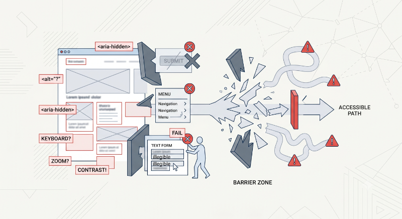
If you've ever opened the WAI-ARIA roles list and felt like you were staring at an alphabetical phone book, you're not alone. There are over 70 ARIA roles, and most documentation just lists them flat — alert, alertdialog, application, article... with no sense of how they relate to each other.
That flat structure is exactly why ARIA bugs are so common. Developers reach for role="region" on a list, or aria-checked on a <button>, without realizing those choices conflict with the role's actual category rules. The W3C spec doesn't organize roles alphabetically — it organizes them into six functional categories, each with its own behavior contract. Once you see roles through that lens, most "why isn't my screen reader announcing this correctly" bugs become obvious.
This post walks through all six categories — widget, composite, document structure, landmark, live region, and window — with runnable code for each. We'll build a small reference site as we go, and you can clone the companion GitHub repository to follow along or use it as a permanent reference.
By the end, you'll be able to look at any ARIA role and immediately know which category it belongs to, what rules it inherits from that category, and what mistakes to avoid.
Prerequisites
- Basic HTML and CSS knowledge
- A modern browser (Chrome, Firefox, Safari, or Edge)
- A screen reader for testing — VoiceOver (built into macOS, enable with
Cmd + F5) or NVDA (free, Windows) - Optional but helpful: Node.js, if you want to run
npx serveto host the demo files locally instead of opening them directly
No frameworks, build tools, or package installations are required — every example in this guide and the companion repo is plain HTML, CSS, and vanilla JavaScript.
Step 1: Understand why categories matter before memorizing roles
Before touching code, it helps to understand the underlying model. The accessibility tree is a parallel structure to the DOM that screen readers actually read from. Every element has three things in that tree:
- A role ("what kind of thing is this" — button, link, list, dialog)
- A name ("what do I call this" — derived from text,
aria-label, oralt) - A state ("what condition is it in" — checked, expanded, disabled)
The six ARIA categories group roles by what kind of relationship they expect with the rest of the tree:
Widget       → standalone interactive controls (switch, slider, tab)
Composite    → containers that own and manage widget children (listbox, radiogroup)
Document     → structural, non-interactive content (list, table, figure)
Landmark     → major page regions for fast navigation (banner, navigation, main)
Live Region  → dynamic content that announces changes (alert, status, log)
Window       → layered UI that behaves like its own window (dialog, alertdialog)
Most real bugs come from violating the relationship a category implies — not from misunderstanding the role itself. Let's go through each one.
Step 2: Widget roles — standalone interactive controls
Widget roles describe interactive elements a user operates directly: clicking, dragging, toggling. They don't require any special parent.
<button role="switch" aria-checked="false" onclick="toggle(this)">
  Dark mode: <span>Off</span>
</button>
function toggle(btn) {
  const isOn = btn.getAttribute('aria-checked') === 'true';
  btn.setAttribute('aria-checked', String(!isOn));
}
A slider is another common widget role — note it needs aria-valuemin, aria-valuemax, and aria-valuenow to be meaningful:
<div role="slider"
     aria-valuemin="0" aria-valuemax="100" aria-valuenow="40"
     aria-label="Volume" tabindex="0">
  Volume: 40%
</div>
Other common widget roles: button, checkbox, link, progressbar, tab (technically composite-adjacent), and tooltip. See widget/index.html in the companion repo for all four live examples, including a full tab/tablist implementation.
Step 3: Composite roles — containers that own widget children
This is where most real-world bugs live. Composite roles are containers that manage and own a specific set of child roles — this is called the "required owned elements" rule in the spec. If you declare a composite role but its children don't carry the expected child role, the relationship breaks.
<!-- ❌ Wrong: listbox has no children with role="option" -->
<div role="listbox" aria-label="Color">
  <div>Red</div>
  <div>Blue</div>
</div>
<!-- ✅ Fixed: children carry the required option role -->
<div role="listbox" aria-label="Color" tabindex="0">
  <div role="option" aria-selected="true">Red</div>
  <div role="option" aria-selected="false">Blue</div>
</div>
The same pattern applies to radiogroup → radio, and to the three-level grid → row → gridcell chain:
<div role="grid" aria-label="Inventory">
  <div role="row">
    <div role="gridcell">Widget A</div>
    <div role="gridcell">12 in stock</div>
  </div>
</div>
Skipping the row level here is a common mistake — gridcell requires a row parent, which itself requires a grid or treegrid ancestor. Removing the middle layer to "simplify" the markup breaks both relationships at once.
Step 4: Document structure roles — non-interactive content shape
Document structure roles describe the semantic shape of content with zero interactivity implied. The good news: most of these are already implicit on native HTML elements, so you rarely need to write them explicitly.
<!-- These already have implicit roles — no ARIA needed -->
<ul>                    <!-- role="list" -->
  <li>Item one</li>     <!-- role="listitem" -->
</ul>

<table>                 <!-- role="table" -->
  <tr><th>Plan</th></tr> <!-- role="row", role="columnheader" -->
</table>
The one place you'll write these explicitly is when you need a non-semantic wrapper to take on document structure, like grouping a caption with an image:
<figure aria-labelledby="fig-caption-1">
  <img src="chart.png" alt="">
  <p id="fig-caption-1">Figure 1: Monthly active users, Jan–Jun 2026</p>
</figure>
There's also role="presentation" (or role="none"), which strips an element entirely out of the accessibility tree — useful for layout-only tables that carry no real tabular meaning, but dangerous if misapplied to content that does matter.
Step 5: Landmark roles — and the most common mistake in this whole guide
Landmark roles mark the major regions of a page so screen reader users can jump between them with a single keystroke (in VoiceOver, Ctrl + Option + U opens the landmark rotor). Most map directly to HTML5 sectioning elements:
| Role | HTML equivalent |
|---|---|
banner |
<header> |
navigation |
<nav> |
main |
<main> |
complementary |
<aside> |
contentinfo |
<footer> |
search |
<search> |
region |
<section> + accessible name |
Here's the mistake that causes a disproportionate number of real-world accessibility violations: putting role="region" directly on a <ul>.
<!-- ❌ Wrong: region overwrites the implicit "list" role,
     orphaning the <li> children's "listitem" role -->
<ul role="region" aria-label="Recent posts">
  <li>Post one</li>
</ul>
ARIA roles don't stack — setting an explicit role replaces the implicit one. The <ul> no longer has a list role, so its <li> children, which require a list ancestor to be valid listitems, become orphaned.
<!-- ✅ Fixed: region on a neutral wrapper; list role untouched -->
<div role="region" aria-label="Recent posts">
  <ul>
    <li>Post one</li>
  </ul>
</div>
One more subtlety: region only becomes a real landmark once it has an accessible name via aria-label or aria-labelledby. An unnamed region is ignored by the landmark rotor entirely.
Step 6: Live region roles — announcing dynamic content correctly
Live regions tell screen readers to monitor an element and announce changes automatically, without the user needing to navigate to it. The three you'll use most: alert (assertive, interrupts immediately), status (polite, waits its turn), and log (sequential updates like a chat feed).
The single most common live-region bug is conditionally rendering the element itself, rather than its content:
<!-- ❌ Wrong: element only exists in the DOM when there's an error,
     so the screen reader has nothing to "watch" beforehand -->
{showError && <p role="alert">{errorMessage}</p>}
<!-- ✅ Fixed: element always present; only its content toggles -->
<p role="alert" aria-live="assertive">{showError ? errorMessage : ''}</p>
This matters because live regions work by being observed — if the element doesn't exist yet when the error fires, there's nothing for the screen reader to be watching, and the announcement is silently dropped.
Step 7: Window roles — dialogs that behave like their own context
Window roles are for layered UI that functions like a separate window: dialog and alertdialog. Both require aria-modal="true" and a label, and both require careful focus management — focus should move into the dialog when it opens, and back to the triggering element when it closes.
<div role="dialog" aria-modal="true" aria-labelledby="dialog-title">
  <h2 id="dialog-title">Account details</h2>
  <button onclick="closeDialog()">Close</button>
</div>
let lastFocusedElement = null;

function openDialog(dialog) {
  lastFocusedElement = document.activeElement;
  dialog.hidden = false;
  dialog.querySelector('button').focus();
}

function closeDialog(dialog) {
  dialog.hidden = true;
  lastFocusedElement?.focus();
}
alertdialog is the same pattern but reserved for cases requiring an immediate response — typically a destructive-action confirmation — and should include aria-describedby pointing at the consequence text.
Reference: all six categories at a glance
| Category | Example roles | Key rule |
|---|---|---|
| Widget | button, switch, slider, tab |
Standalone, no required parent |
| Composite | listbox, radiogroup, grid |
Must own specific child roles |
| Document structure | list, table, figure |
Often implicit on native HTML |
| Landmark | banner, navigation, region |
region needs an accessible name |
| Live region | alert, status, log |
Element must persist in the DOM |
| Window | dialog, alertdialog |
Requires focus trap + aria-modal |
What's next
- Pair this with a real screen reader test pass — VoiceOver and NVDA behave differently enough that testing in only one will hide bugs
- Read up on the "required owned elements" and "required context role" sections of the W3C ARIA spec for the full per-role ownership tables
- Audit one real page in your own app against each of the six categories — most teams find their landmark and live region usage is where the gaps are
- Once this clicks, the companion practical post on fixing six common WCAG 2.2 AA violations builds directly on these category rules
Further reading
- WAI-ARIA 1.2 Specification — Roles Categorization{:target="_blank"}
- MDN: ARIA Roles Reference{:target="_blank"}
- WebAIM: ARIA Live Regions{:target="_blank"}
- W3C: Using ARIA Landmarks{:target="_blank"}
- NVDA Screen Reader (free download){:target="_blank"}
- Deque University: ARIA Authoring Practices{:target="_blank"}
Closing
ARIA roles stop being intimidating once you stop treating them as a flat list and start treating them as six small contracts. Widget roles stand alone. Composite roles own their children. Document structure roles describe shape. Landmark roles need names. Live regions need to already exist. Window roles need focus management. That's the whole model.
All of the examples in this post are live and runnable in the aria-roles-explained repository — clone it, open any index.html, and turn on a screen reader to hear the difference between the wrong and fixed patterns for yourself.
Read next
Comments (0)
Join the conversation
Sign in to leave a comment on this post.
No comments yet. to be the first!