How to Fix 6 Common WCAG 2.2 AA ARIA Violations in Any Web App

D. Rout
June 18, 2026 9 min read
On this page
Introduction
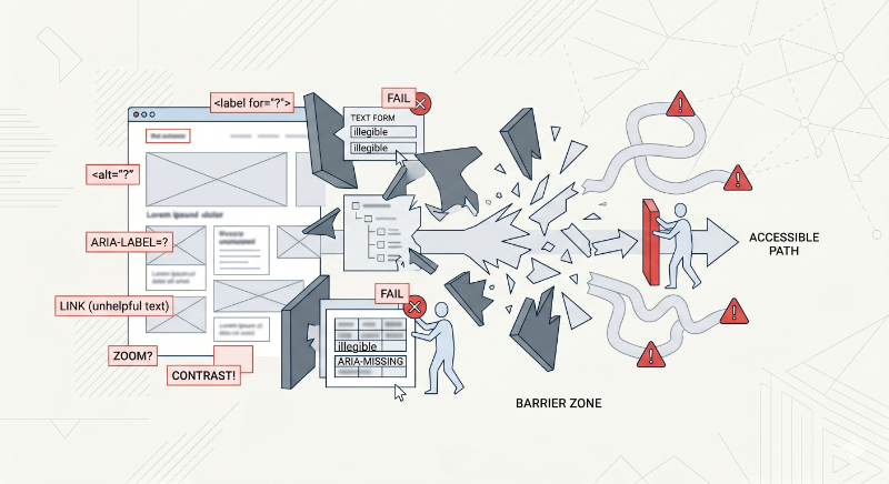
Accessibility audits have a way of producing the same six violations over and over, no matter what framework, design system, or team wrote the code. This post walks through exactly that: six recurring WCAG 2.2 AA ARIA violations, why each one happens, and the concrete fix for each — written for any web application, not tied to a specific framework.
If you've run an automated scanner like axe DevTools, ARC Toolkit, or Lighthouse against a real production app, these six issue types will look familiar:
- ARIA elements do not have accessible names
- ARIA elements missing child roles
- ARIA child roles missing their required parent element
- Image elements without alt attributes
- Elements using prohibited ARIA attributes
- Touch targets with insufficient size or spacing
We'll fix each one with plain HTML, CSS, and vanilla JavaScript, and build a small reference site as we go. Clone the companion GitHub repository to follow along with runnable before/after examples for every issue.
Prerequisites
- Basic HTML, CSS, and JavaScript knowledge
- A modern browser
- A screen reader for verification — VoiceOver (
Cmd + F5on macOS) or NVDA (free, Windows) - Optionally, an automated accessibility scanner like axe DevTools to confirm fixes
No build tools or frameworks are required for any of the patterns below.
Step 1: Fix missing accessible names
An accessible name is what a screen reader speaks when it focuses an element. It can come from visible text, aria-label, aria-labelledby, or alt. Without one, assistive tech announces only the role — "button" — with zero context.
The most common trigger is an icon-only button:
<!-- ❌ Wrong: announces only "button" -->
<button>
  <svg><!-- close icon --></svg>
</button>
<!-- ✅ Fixed: announces "Close dialog, button" -->
<button aria-label="Close dialog">
  <svg aria-hidden="true"><!-- close icon --></svg>
</button>
A second common trigger: relying on a placeholder instead of a real label. Placeholders disappear once text is entered and many screen readers skip them entirely.
<!-- ❌ Wrong -->
<input type="email" placeholder="Email address">
<!-- ✅ Fixed -->
<label for="email">Email address</label>
<input id="email" type="email" placeholder="you@example.com">
And a third: clickable <div> cards with no semantic element or accessible name at all.
<!-- ✅ Fixed: a real link with a full accessible name -->
<a href="/products/running-shoe" class="card">
  <img src="shoe.jpg" alt="">
  <span>Trail Runner X2 — $89</span>
</a>
Step 2: Fix ARIA elements missing child roles
Some ARIA roles require specific child roles — the spec calls this the "required owned elements" rule. role="list" expects listitem children; role="listbox" expects option children. Putting plain elements directly inside breaks that ownership chain.
<!-- ❌ Wrong: buttons with no listitem wrapper -->
<ul role="list">
  <button>Item one</button>
  <button>Item two</button>
</ul>
<!-- ✅ Fixed: correct list → listitem → button chain -->
<ul>
  <li><button>Item one</button></li>
  <li><button>Item two</button></li>
</ul>
If you need the button to fill a CSS grid cell directly without visual nesting, use display: contents on the <li> rather than removing it — that keeps the accessibility tree intact while letting the layout ignore the wrapper.
The same rule applies to custom listboxes:
<!-- ✅ Fixed: children carry the required option role -->
<div role="listbox" aria-label="Color" tabindex="0">
  <div role="option" aria-selected="true">Red</div>
  <div role="option" aria-selected="false">Blue</div>
</div>
Step 3: Fix ARIA child roles missing their parent element
This is the inverse of Step 2. Some roles only make sense inside a specific parent — the "required context role" rule. The single most common trigger for this violation:
<!-- ❌ Wrong: role="region" overwrites the implicit "list" role,
     orphaning the <li> children's "listitem" role -->
<ul role="region" aria-label="Recent posts">
  <li>Post one</li>
</ul>
ARIA roles replace implicit roles rather than adding to them. Once region is set, the <ul> no longer has a list role, so its children — which require a list ancestor to be valid listitems — become orphaned.
<!-- ✅ Fixed: region on a neutral wrapper; list role untouched -->
<div role="region" aria-label="Recent posts">
  <ul>
    <li>Post one</li>
  </ul>
</div>
The same pattern shows up with tabs:
<!-- ✅ Fixed: tab wrapped in its required tablist context -->
<div role="tablist" aria-label="Account sections">
  <button role="tab" aria-selected="true">Profile</button>
</div>
A useful mental model: a job title like "VP of Engineering" only means something inside a company org chart. Pull it out of context and list it on its own, and it's meaningless — there's no hierarchy giving it sense. ARIA child roles work the same way.
Step 4: Fix images missing alt attributes
The alt attribute tells screen readers what an image contains. Without it, some screen readers announce the raw file path — meaningless noise. There are two correct states, and the violation is having neither:
<!-- ❌ Wrong: announces the raw file path -->
<img src="assets/icons/user-profile-avatar-v2.png">
<!-- ✅ Fixed: descriptive alt for a meaningful image -->
<img src="assets/icons/user-profile-avatar-v2.png" alt="User profile photo">
<!-- ✅ Fixed: empty alt tells screen readers to skip a decorative image -->
<img src="divider-line.svg" alt="">
When an icon sits inside a button that already has its own accessible name, hide the icon entirely to avoid double-announcing:
<button aria-label="Delete item">
  <img src="trash.svg" alt="" aria-hidden="true">
</button>
CSS background-image is invisible to screen readers — there's no DOM node to attach an alt to. If a background image is meaningful, give its container an explicit role and label:
<div class="hero" role="img" aria-label="Skyline of Manhattan at sunset"></div>
Step 5: Fix elements using prohibited ARIA attributes
Every ARIA role has a defined set of attributes it's allowed to carry. Using a prohibited one isn't just ignored — it can produce incorrect or confusing announcements. The most common case: aria-label on a plain <div> or <span>, which has the implicit role="generic" and doesn't support naming attributes at all.
<!-- ❌ Wrong: aria-label has zero effect on role="generic" -->
<div aria-label="User card">...</div>
<!-- ✅ Fixed: use a role/element where aria-label is valid -->
<section aria-label="User card">...</section>
aria-checked is another frequent offender — it's only valid on checkbox, radio, switch, and menuitemcheckbox roles, not on a generic toggle button:
<!-- ❌ Wrong -->
<div role="button" aria-checked="true">Apply filter</div>
<!-- ✅ Fixed: use aria-pressed for toggle buttons instead -->
<button aria-pressed="true">Apply filter</button>
And avoid overriding a native element's role when the element you actually want already exists:
<!-- ❌ Wrong -->
<button role="link">Go to homepage</button>

<!-- ✅ Fixed -->
<a href="/">Go to homepage</a>
Step 6: Fix touch targets with insufficient size or spacing
WCAG 2.2 Success Criterion 2.5.8 requires interactive targets to be at least 24×24 CSS pixels, with enough spacing that adjacent targets don't overlap that minimum zone. Apple's Human Interface Guidelines and Google's Material Design both recommend going further, to 44×44px. The usual cause is an icon button styled to its visual size with no padding around the actual tap area.
/* ❌ Wrong: 16px visual icon, 16px tap area */
.icon-btn {
  width: 16px;
  height: 16px;
}
/* ✅ Fixed: padding expands the tap area while the icon stays visually small */
.icon-btn {
  min-width: 44px;
  min-height: 44px;
  display: inline-flex;
  align-items: center;
  justify-content: center;
}
.icon-btn svg {
  width: 20px;
  height: 20px;
}
Spacing matters as much as size — two 44px buttons with only a 2px gap functionally merge into one mis-tappable zone:
/* ❌ Wrong */
.action-row { display: flex; gap: 2px; }

/* ✅ Fixed: keeps each target's minimum zone from overlapping its neighbor */
.action-row { display: flex; gap: 8px; }
Reference: violation types and their fixes
| Issue | Root cause | Fix pattern |
|---|---|---|
| Missing accessible names | Icon-only buttons, placeholder-only inputs | aria-label, real <label>, semantic elements |
| Missing child roles | Custom widgets without required children | Add the owned child role (listitem, option, row) |
| Missing parent element | role="region" overwriting implicit roles |
Move the role to a neutral wrapper <div> |
| Missing alt attributes | No alt at all on <img> |
Descriptive alt or empty alt="" for decorative images |
| Prohibited ARIA attributes | Naming/state attributes on incompatible roles | Match the attribute to a role that supports it |
| Insufficient touch targets | Visual icon size used as the tap area | Pad to 44×44px minimum, 8px+ gap between targets |
What's next
- Run an automated scanner (axe DevTools, ARC Toolkit, or Lighthouse) against your own app and map each finding to one of these six categories
- Pair every fix with a manual screen reader pass — automated tools catch maybe a third of real accessibility issues
- Build these patterns into a shared component library so the fix only has to happen once per component, not once per page
- If your team is just getting started with the underlying ARIA role model, the companion theoretical post on all six ARIA role categories is a good next read
Further reading
- WCAG 2.2 Success Criterion 2.5.8: Target Size (Minimum){:target="_blank"}
- W3C: ARIA Authoring Practices Guide{:target="_blank"}
- MDN: ARIA — Accessible Rich Internet Applications{:target="_blank"}
- Deque: axe DevTools accessibility scanner{:target="_blank"}
- Apple Human Interface Guidelines: Layout{:target="_blank"}
- NVDA Screen Reader (free download){:target="_blank"}
Closing
None of these six fixes require a framework migration or a design system overhaul — they're targeted markup and CSS changes you can apply incrementally, component by component. The pattern that matters most is the audit loop: scan, match the finding to one of these six categories, apply the fix, and re-scan to confirm.
Every example above is live and runnable in the wcag-aria-fixes-demo repository, with the wrong and fixed versions side by side in each issue folder — clone it, open any index.html, and test with a screen reader to hear the difference yourself.
Read next
Comments (0)
Join the conversation
Sign in to leave a comment on this post.
No comments yet. to be the first!